Friday, March 16, 2012

Making Fake Blood


We spent some time, while deciding our location, making fake blood using Strawberry Sauce and Natural Red Food Colouring. We originally were just going to use the strawberry sauce but decided that adding red food colouring would make it a darker red which would be more realistic for blood, especially when it dries. However, on the day of shooting, we made the fake blood and it appreared to be too light. We then decided to add Brown Sauce to make it darker and appear less fresh and more dirty. We used this on Jody (playing little girl Holly) on the side of her forehead when she is in the car crash, and her skin when she turns evil. At first we were worried that it wouldn't look real, but after playing around and smudging it and after it dried a bit, we were happy with the way it looked in the end.


Thursday, March 15, 2012

Making The Photo Frame

To create the photo frame, we took the pictures of each person individually as we couldn't have all of the 'family members' in the same place at the same time. For the parents, we asked Miss Thompson and Mr Shearing to pose as if they were in a family photo for us.

Here are the original photos of each person that we took:


We then edited them so that that there was no background meaning we could easily put the photos on top of each other, creating the illusion that all of the people were photographed together. Here is what the edited photo looked like, we created a 'green screen' behind them and then edited the green out:


Here is the final photo on the left, and the photo with the little girl edited out on the right. We made a video with the two photos fading into each other making it look like the little girl had faded away:


This means that the video must be edited in meaning that we cannot have an actual photo in the frame when filming. To make it easier to edit in, we have placed some green card inside the photo frame to act as a green screen. We will then add in the video to make it look as if the girl is fading away from her family. Here is a picture of what the original footage looked like with the green card in:

Here is what the final scene looked like with the video edited in. You can see that there is no green visible:

Wednesday, March 14, 2012

Finding Red Contact Lenses

For the end scene of our thriller, we needed red contact lenses for our main character to wear. Having red eyes will make her look evil and will represent danger. This will tell the audience that she is dangerous and possessed. 

We searched online for some contacts and found some on Amazon.com which we thought would work well. They had good customer reviews, both 5 stars so we could trust that they were good quality. They also came with solution so that we can take care of the contact lenses in between shooting whilst we're not using them.


Here are the contacts in the bottles they come in with a picture on the box to show what they look like when in use. We think they will work well and be effective in our thriller.


Friday, March 2, 2012

Creating Our Blocks

We have decided to create the building blocks that we will show the title with. We asked Mr Jagger to cut us out some 6x6x6cm blocks out of wood. The blocks wil spell out or title 'Solemn'.
We asked Mr Jagger to cut us out 7 6x6x6cm wooden cubes to spell out our title'Solemn' with one practise block.

We then went into the Art Department and painted all of the blocks with white paint.

We then used the stencils that we had previously made to paint the letters spelling out 'Solemn'.

Here are the finsihed blocks. We will use this in the title sequence in the opening of our thriller.

Here we are in the Art Department painting the blocks for our thriller.

Creating Stencils For Our Blocks

As we are planning to make the building blocks in our thriller that spell out the title, I made some stencils to help us. These stencils will help us make sure that the letters are all the same size/font and will make it easier for us to put the letters on the blocks.

Our Blocks are 6x6x6cm so I made sure that the stencils would fit onto them

I then drew on the letters needed to spell out our title 'Solemn'.
I used the font Times New Roman to copy the style as this is a
classic font and isn't too childish.

I then cut the letters out using a craft knife. These are the finished stencils.

Thursday, March 1, 2012

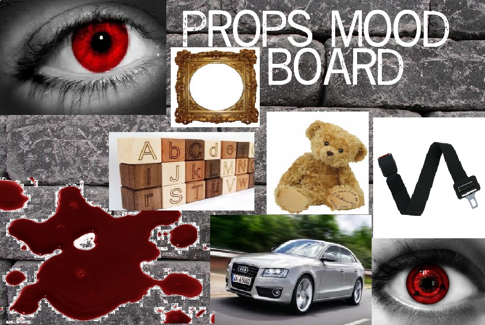
Props Mood Board

This is our props mood board that highlights all the props that we will be using throughout the thriller. These include:
Red contacts, photo frame, letter blocks, seat belt, car, teddy bear, and fake blood.
Props are used to enhance the thriller and could add different meanings to different plots. Some props could be the centre of a story line with the characters all involved with the prop, then the storyline developing from the prop. They could also be given significance and meaning while also representing something important to the story.
The props could hold symbolism in the thriller. The teddy bear that the main character holds will represent innocence and childhood. This is then tainted when the young girl turns evil and she is still holding the teddy bear, then it is seen in a negative light.
The red contacts are used to enhance and clearly show the audience that the girl is now haunted/evil. They will be shown at the end when the suspense has been built up, but then the introduction will end, this will then go on to raise questions, which will then be answered throughout the rest of the thriller.  

Poster Ideas

We began thinking of ideas for our poster so we knew what photos we needed to take for it. We wanted a poster that advertised what the film was about but didn't want to give too much away. We wanted to make the audience interested and raise questions so they would have to see the film to find out the answers.

In our first design we put bricks as the background as we thought this could create mystery however we felt that the brick background didn't relate to the story and was misleading. We also liked the idea of having the girl in the poster however we decided that if we were to have her in the poster then we would want the whole of her body and not just her face. We like the idea of using the blocks for the title as this relates to the opening of the thriller as they are used in the same way to spell out the title. We also liked the idea of putting a slogan at the top of the page as slogans are a good way of advertising.
Design #1
In our second design we thought about showing the family photo used in the opening of the thriller as this would raise questions. However we weren't sure if it related to the story enoguh as it's only in the thriller for one scene. We also weren't sure about the cracked glass in the photo frame as again, this doesn't happen in the thriller. We also liked the idea of having blood stains and fingerprints and would want to use this in the final psoter as it also creates mystery. We have also decided that we want to put small credits at the bottom to make sure it looks like a real, professional film poster.
Design #2
In our third design, we made sure the little girls whole body was in it as we wanted her to look isolated. We liked this idea as it relates to the film because she is alone and has been taken away from her family. However we felt that she should be even further away to show how isolated she really is. She is holding a teddy to show her innocence but it still raisies questions as to why she is alone. We liked the idea of using a dark background aswell as it will inform the audience that it is a thriller.
(Design #3
In our fourth design we used a red background as this represents danger. We liked this idea because it would also remind the audience of blood which we will be using in our thriller. We also liked the idea of using a teddy bear in the poster as it informs the audience that there is a young child in the film yet we don't know who or why. Although this creates mystery, we were unsure whether it told the audience enough and whether it raised enough questions for them to want to come and see the film.
Design #4
Here is our final design. We took elements from each poster but mainly focused on design #3 and the blocks from design #1. We intend to include some blood stains aswell to create some more mystery and inform the audience that it is a thriller. We will have a slogan at the top of the poster though we do not know what it will be yet. We plan on using a dark background with the little girl very far away to show that she is alone and vulnerable. The teddy and the building blocks will remind the audience that she is still a young girl. We also plan on having the girl wearing red contacts to show that she is possessed which will raise questions. This way the audience know what to expect from the film but do not know too much and will still have many questions.