Here is the final edit for our opening 2 minutes of a thriller.
Showing posts with label Megan Perfect. Show all posts
Showing posts with label Megan Perfect. Show all posts
Tuesday, June 5, 2012

Saturday, May 5, 2012
Evaluation 7
Looking back at your preliminary task, what do you feel you have learnt in the progression from it to a full product?
Here is a video of us explaining how we have developed and improved from our preliminary task:
Evaluation 6
What have you learnt about technologies from the process of constructing this product?
Throughout the making of our thriller, we have learnt that many types of technology are needed to make it. We also learnt of the importance of the internet when marketing and how new technologies such as smart phones can help you in many different ways. Here is a video explaining the technologies we used:
Evaluation 4
Who would be the audience for your media product?
 Name: Claire Martins


Age: 18
Studying English Literature and Philosophy at Cambridge University.
Has a part time job as a sales assistant at Debenhams. Enjoys going out with her friends for meals and movie nights. Her favourite foods are spaghetti, fruit and donuts and enjoys going to Nando’s at the weekend.
Her favourite film is Mean Girls but also enjoys thrillers such as The Perfect Getaway. Her favourite TV Shows are 90210 and Friends and she enjoys listening to her favourite artists, Jessie J and The Script. She enjoys dancing and performs in ballet recitals on a regular basis.
Name: Lewis Harley
Age: 19
Works full time at HMV
Lives at home with his mum and younger brother, Greg. Enjoys watching films and listening to loud music. His favourite bands are Metallica, Nirvana and Arctic Monkeys. His favourite TV show is Family Guy and his favourite films are the Final Destination series.
Enters skateboarding competitions often, has come 2nd place in the Southend Over 18’s Skateboarding competition.
Enjoys eating junk food such as pepperoni pizza, hotdogs and is always seen hanging out at Burger King.
These are the type of people we are aiming our thriller at because they're middle class, sociable people but also people who enjoy films. We are aiming at groups of friends and film lovers to come and view our thriller at the cinema as these are the type of people who we think will enjoy it the most.


Evaluation 1
In what ways does your media product use, develop or challenge forms and conventions of real media prodcuts? (i.e. of film openings)
 The title of our film is first shown when Jody spells it out using the building blocks we made. However, it is not fully clear that is the title until it is displayed at the end. This way of introducing the title into the actual footage is unusual and would go against typical conventions of a thriller as they would usually just edit the title in during the opening on a black background.
 However, in the case of the font style of the thriller, our title does follow traditional codes and conventions in terms of font style. It is quite simple but also quite a quirky, spooky font which suits the genre. For example; in the film Black Swan, the title shot is plain black words on a white background, which is very similar to what we have done, however we decided to switch the colours around as it seemed darker and more fitting for our thriller.
 In terms of settings and locations we had main locations while filming. We had a red room, which was Megan's Dad's study. This was our main location as this is where we witness the change that Jody goes through, turning from inncocent to evil. We would say that this goes with codes and conventions of a thriller because alot of films use colours to symbolise danger and/or isolation. This screenshot also introduces the character Jody. It shows her happily playing with her teddy and some building bricks. She is introduced straight away while the opening credits are being shown.
 We also used Megan's Dad's car to film to flashback car crash scene. This goes partly with and party against conventions of a thriller because although flashbacks are used often in films, car scenes at the camera angles we used are not common.
 This screenshot shows the majority of props we used as well as the costume. Here you can see a teddy, the building bricks, a photo frame, her white dress, and her hair and brusing make-up. We would say that this goes with conventions of a thriller as films often use props to symbolise things and make-up for effect. In our case, the teddy, white dress and hair in bunches shows her innocence, contrasting against the red background which represents danger.
 In terms of the story, the main shot that sets what the film is about comes right at the end of the opening. It goes with traditional conventions of a thriller because extreme close ups are often used to show the expression of the characters. Red contact lenses or make-up/props are often used there abouts.
 Genre wise, we have followed conventions of a thriller by having a scene with fake blood. This shows that it is a thriller. Lots of thrillers include fake blood and we used it in the car crash scene along with make-up to show that Jody had died.
 Lastly, our best piece of editing was the photoframe shot. We used an aerial shot to look down on the photoframe as though we were seeing it through Jody's eyes. We used green card to make a green screen and edited in a Mum (Ms Thompson), a Dad (Mr Shearing) and Jody to make a family portrait type picture. We then made Jody fade from the picture as she died, like she never even existed. This, although is rare to see depending on the story of the thriller, has been done before in thrillers and therefore would follow typical conventions of a thriller. However, we were pleased with how it looked and thought the idea was clever. It shows a key moment in the opening as it makes the audience realise that she has died and makes the audience feel sorry for her and wonder what she will do next.
Sunday, April 29, 2012
Slogan Ideas
For our poster, we've decided to use a slogan as we think this would be a good way of advertising. We want to create a slogan that will stick in people's mind, raise quesions and make them want to see the film. Here are a couple of ideas we had:

We thought of 'Life isn't as pretty as it seems' as it relates to the little girl not being so cute and pretty anymore however we felt this had a slight comedic side to it and didn't suit the film genre well. This also applied to another idea of ours 'Life isn't always a ring a roses' which we came up with as the nursery rhyme 'Ring A Roses' will be in the background of our thriller.
We liked using the word 'life' in the slogan as we thought it related to the film well because the little girl loses her life during the car crash.
We also liked using the word 'innocence' because the girl loses her innocence when she becomes possessed. For example 'Little girls aren't as innocent as they seem' was one of our ideas however we felt that this wasn't very original and had probably been used before.
Other ideas that we had that arnt shown on the image were "little girls are sweet, so is revenge" and also "innocence lost". Both of these were good, the first one mentions that the character is a young girl, which reperesents innocence itself, where as the second one says the word, however wer thing it is too short and wouldnt mean much to the audience.
we also thaught of "innocence is captured, revenge is released"- this was good as it had rhythem to it, and could be easily remember by the audience, ewhich is what a slogen should do.
There was also "innocence leaves and evil takes over", we didnt like this one as much as we thaught it was too blunt and didnt leave as many questions as previous ideas.
We will ask the public which one they like best, so it isnt just our opinion and we can get different veiws on it.
Poster
Here is the final poster for our thriller 'Solemn'. We have included the title of the film. credits, a slogan and the BBFC rating of 15. We decided to use a forest setting to show that she was isolated and completely alone. We liked to use the building blocks in the scene as it is relevant to the young age of the girl and it stood out well against the background. We also put the BBFC rating and credits on to make it look more realistic like a real poster.

Poster Influences
Our poster can be compared to two thriller posters we found; Red Riding Hood and Childish Games.

Our poster can be compared to Red Riding Hood by the use of the forest setting, the character and the layout of the title and slogan etc. We both have our slogans at the top of the poster. We both have a similar character of a girl in the center of the poster and we both have put the title near the bottom. However, differences between these posters would be that Red Riding Hood doesn't include the credits at the bottom or the BBFC certificate it has been given. It has however, got the release date on show. Also, the graphics of the picture looks less realistic to ours, almost animated. The clour schemes are also slightly different as Red Riding Hood is more dark and red, where as we have gone for naturalistic lighting and white. And obviously, the position of the main character is different as our character is sitting rather than standing.
 We think the most similar to ours would be Childish Games.
Both these posters feature a little girl with a teddy in a forest. They both show the credits at the bottom, however the rest of the layout is slightly different. We also, looked up the storyline for this film to see if the film was similar but it wasn't therefore it was only an influence becuase of the poster.
Our poster would be a combination of the Childish Games poster picture and the Red Riding Hood poster layout.
Our poster would be a combination of the Childish Games poster picture and the Red Riding Hood poster layout.
Saturday, April 28, 2012
Zone D Logo
Here is the logo we have created for our production company 'Zone D Productions'. It will feature at the beginning of all of the films we make including the opening 2 minutes of our thriller.

Wednesday, April 18, 2012
Diary of a Day Filming
We spent one day filming in our chosen location outside Megan and Jody's houses. Admittedly, we weren't fully prepared, as although we had remembered all the props, costumes and everything we needed, we were not exactly sure of our locations. Megan's Mum's house and Dad's house are within a short drive from eachother, as well as the option of Jody's house, so we decided to try out different settings from what was available and decided what would look best. In the end, we used Megan's Dad's car and Megan's Dad's study/spare room. We were happy with our choice as the room was red which is symbolic of danger and was a great contrast with the white costume. We were also undecided on where to take our poster shot but fortunately Megan knew the area well and we found a small isolated forest which fitted well and made the building blocks props look really good and they stood out well.
In terms of shooting, first we did the pale make-up and put Jody's hair in neat bunches as well as putting Jody into her costume. We then decided to get the poster shot done while her make-up and hair was made up in the right way. We found the nearby forest location we wanted to use and got Jody and the teddy bear into the position we wanted. We then placed the building blocks into the scene closer to the camera and layed them out wonky. We think this effect worked really well and the title really stands out. We also liked how Jody looked in this shot as you can tell she is isolated and alone, which is what we wanted to portray within the opening.
We then shot the first scene which was the car crash. We got Megan's Dad to drive into a nearby lay-by where passing cars could be seen. We hoped this would make it look more realistic like the car was moving for the crash. We then went back to make the blood and paint it on Jody as well as messing up her bunches and then returning to shoot the aftermath of the car crash scene.
Then we redid the bruises and blood onto Jody and messed up her hair even more to shoot in our second location; Megan's Dad's study. We moved a few things around so the room looked empty and talked Jody through the kind of things she needed to do, for example; hugging Bernard the teddy bear and then throwing him to the side and stacking the building bricks and then knocking them down.
Lastly, we helped Jody to put her red contact lenses in for us to shoot the last shot; an extreme close up of her eyes opening.
We then checked back over some of the footage to make sure we had everything we needed. We had made sure to film everything multiple times over in different angles etc. to make sure it would look ok when editing. So only when we felt confident we had everything we needed we finished shooting.
Tuesday, April 17, 2012
Monday, April 16, 2012
Filming The Thriller


We filmed using Scarlett's brother's camera and tripod. We used Megan's Dad's car, a room in Megan's Dad's house and a wood nearby for the poster. We remembered to use a range of shots in each scene so that the film can be well edited and shots can be fitted by what is suited by the scene itself. We were happy with our locations as we think they represented what we wanted for our filming well.
Tuesday, March 27, 2012
Shooting Schedule
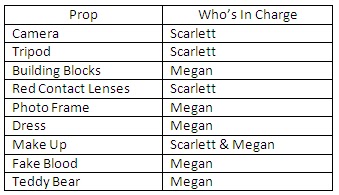
On Saturday 31st March 2012, we will be shooting the whole of our thriller. To ensure that we get everything done, we have created a shooting schdeule which we aim to follow throughout the day. We have also made a table as to who is in charge of what props. We aim to be meeting at 9:00am and finish at around 5:00pm.
Props
Shooting Schedule

Monday, March 19, 2012
Practising Hair & Make-up
We practised the make-up for our thriller. The left side shows fake bruises to show she's been in a car accident. The right side is dark make-up to show she's turned dark and evil. We decided to use both of these make-up styles for our thriller. We will use the bruise make-up for the car crash scene and the dark make-up for the shot when she is evil, she will also have red contacts in this scene.

We also tried the make-up with red lips to represent evil and danger, however we felt this didn't look right and there was too much make-up and it looked unatural for a child to wear this so we will use red contacts to represent the danger instead.

We tied up her hair in bunchies to make her look younger and more innocent. The right side is more neat and tidy, this is the hairstyle we'll be using during the car crash, messing it up a bit afterwards to show that she's hurt. The left side is a lot messier and more rough, we will be using this hairstyle whenshe's possessed to show that she's not so cute and innocent anymore. To do this we straightened her hair and tied them up with small hair ties. The left side was then backcombed to get bigger and messier. We will use hairspray to hold it in place when filming so that there is continuity.

Saturday, March 17, 2012
Props

Weused wooden blocks from the Technology Department and painted them using the Art Department and stencils that Scarlett made in order to spell out SOLEMN. We used these blocks in the poster, and while filming Jody was shown playing with them.

We used Megan's teddy bear Bernard in the poster and he is also shown in the thriller filming.

Friday, March 16, 2012
Practising the Car Crash

We put Jody (playing the little girl Holly) in her car to test out what shots would be good to use and how we would create the car crash scene. We videoed Jody hitting her head forward onto the car seat in front while we figured out how to position the camera for this scene. We tried an over the shoulder shot from behind, a shot from each side window, a shot from the front passenger seat and a close up of Jody's face as it hits the seat from the view of the backseat passenger. We needed to practise what shots we are using and when so that we know how to film to real thing. We need to use for than one shot because when she falls backwards back into her seat she will have blood on the side of her forehead.
We are as yet undecided on whether to have the car moving at the time or not. We will be filming in slow motion so it wouldn't really matter if the car was moving at the time. However, if it is we may be able to get Jody to emphasise the impact of the crash more as the car will actually have to break hard. If we decide not to have the car moving, we still know how to make the crash look realistic so we may end up trying both ways when we film. It also depends on what is available to us on the day and whether we have the driver of the car with us and they are willing to drive or not.
Making Fake Blood


We spent some time, while deciding our location, making fake blood using Strawberry Sauce and Natural Red Food Colouring. We originally were just going to use the strawberry sauce but decided that adding red food colouring would make it a darker red which would be more realistic for blood, especially when it dries. However, on the day of shooting, we made the fake blood and it appreared to be too light. We then decided to add Brown Sauce to make it darker and appear less fresh and more dirty. We used this on Jody (playing little girl Holly) on the side of her forehead when she is in the car crash, and her skin when she turns evil. At first we were worried that it wouldn't look real, but after playing around and smudging it and after it dried a bit, we were happy with the way it looked in the end.


Friday, March 2, 2012
Creating Our Blocks
We have decided to create the building blocks that we will show the title with. We asked Mr Jagger to cut us out some 6x6x6cm blocks out of wood. The blocks wil spell out or title 'Solemn'.
 |
| We asked Mr Jagger to cut us out 7 6x6x6cm wooden cubes to spell out our title'Solemn' with one practise block. |
 |
| We then went into the Art Department and painted all of the blocks with white paint. |
 |
| We then used the stencils that we had previously made to paint the letters spelling out 'Solemn'. |
 |
| Here are the finsihed blocks. We will use this in the title sequence in the opening of our thriller. |
 |
| Here we are in the Art Department painting the blocks for our thriller. |
Thursday, March 1, 2012
Poster Ideas
We began thinking of ideas for our poster so we knew what photos we needed to take for it. We wanted a poster that advertised what the film was about but didn't want to give too much away. We wanted to make the audience interested and raise questions so they would have to see the film to find out the answers.
In our first design we put bricks as the background as we thought this could create mystery however we felt that the brick background didn't relate to the story and was misleading. We also liked the idea of having the girl in the poster however we decided that if we were to have her in the poster then we would want the whole of her body and not just her face. We like the idea of using the blocks for the title as this relates to the opening of the thriller as they are used in the same way to spell out the title. We also liked the idea of putting a slogan at the top of the page as slogans are a good way of advertising.
 |
| Design #1 |
In our second design we thought about showing the family photo used in the opening of the thriller as this would raise questions. However we weren't sure if it related to the story enoguh as it's only in the thriller for one scene. We also weren't sure about the cracked glass in the photo frame as again, this doesn't happen in the thriller. We also liked the idea of having blood stains and fingerprints and would want to use this in the final psoter as it also creates mystery. We have also decided that we want to put small credits at the bottom to make sure it looks like a real, professional film poster.
 |
| Design #2 |
In our third design, we made sure the little girls whole body was in it as we wanted her to look isolated. We liked this idea as it relates to the film because she is alone and has been taken away from her family. However we felt that she should be even further away to show how isolated she really is. She is holding a teddy to show her innocence but it still raisies questions as to why she is alone. We liked the idea of using a dark background aswell as it will inform the audience that it is a thriller.
 |
| (Design #3 |
In our fourth design we used a red background as this represents danger. We liked this idea because it would also remind the audience of blood which we will be using in our thriller. We also liked the idea of using a teddy bear in the poster as it informs the audience that there is a young child in the film yet we don't know who or why. Although this creates mystery, we were unsure whether it told the audience enough and whether it raised enough questions for them to want to come and see the film.
 |
| Design #4 |
Here is our final design. We took elements from each poster but mainly focused on design #3 and the blocks from design #1. We intend to include some blood stains aswell to create some more mystery and inform the audience that it is a thriller. We will have a slogan at the top of the poster though we do not know what it will be yet. We plan on using a dark background with the little girl very far away to show that she is alone and vulnerable. The teddy and the building blocks will remind the audience that she is still a young girl. We also plan on having the girl wearing red contacts to show that she is possessed which will raise questions. This way the audience know what to expect from the film but do not know too much and will still have many questions.
 |
Subscribe to:
Posts (Atom)