Monday, April 30, 2012

Twitter Page

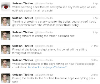
We have created a Twitter page for 'Solemn Thriller'. As social networking is becoming increaingly popular and more and more people are turning to them, we thought that this was another good way to advertise. Many films are advertised on Twitter, and with the world wide reach that it had it enables us to get as big an audience as possible.
We try to keep posting as regularly as we can, using our mobile phones as well to keep up to date. 

We wanted to keep posting to keep the audience and followers up to date. We posted links off YouTube and Facebook on the twitter page to get people to view out other types of media pages.


Facebook Page

We created a Facebook page for 'Solemn Thriller'. With over 250 million people connected on Facebook worldwide, it creates a huge market base, where many other businesses can promote, and offer deals, products, and services.
It is good for promoting out thriller as we can reach lots of people, but also target the audience that we have previously assembled. Facebook attracted people of a very wide age range, so to get the most out of promoting our thriller on Facebook, we could make sure the colours, quotes and reviews are aimed at the target audience and easy to see. We wouldn't want to advertise among other competitors or sectors that have nothing to do with our genre or age range, so therefore we would be segmented in with the same groups and competitors as ours.
We started our Facebook page with the original logo.


We are keeping the Facebook page up to date, with pictures. 


We are also adding statuses that will keep the audience updated on what we are doing, for the timeline. If it was a real film being released in cinema, the Facebook page would be good promotion as they can keep posting when the film will be in cinema's, so people will remember. To have a less formal approach, the film pages often put backstage pictures and videos on them as they will make the audience more anticipated to see the film, as they are getting hints of it through the build up. Promotion for a film is one of the most important stages that requires a lot of effort to keep up and keep the public aware of the film.  

Public Choosing Best Slogan

As a group we were undecided on which slogan to go with, so we decided the simplest way to choose one was ask people. the choices for them to choose were:
1) "little girls are sweet, so is revenge"
2) "innocence is masked by sweet revenge"
3) "innocence is captured, revenge is released"
4) "innocence leaves and evil takes over"

These are the results we got:
1) 12
2) 3
3) 8
4) 2

These results are quite reliable, as we asked a variety of age groups and genders. Some comments people made included:
"Number 3 is quite sinister and evil, and has a more serious tone"
"Number 1 is good as it mentions the character in the plot."

Overall, the chosen slogan (1) will be featured on out poster, and promotion visuals. 

Sunday, April 29, 2012

Slogan Ideas

For our poster, we've decided to use a slogan as we think this would be a good way of advertising. We want to create a slogan that will stick in people's mind, raise quesions and make them want to see the film. Here are a couple of ideas we had:


We thought of 'Life isn't as pretty as it seems' as it relates to the little girl not being so cute and pretty anymore however we felt this had a slight comedic side to it and didn't suit the film genre well. This also applied to another idea of ours 'Life isn't always a ring a roses' which we came up with as the nursery rhyme 'Ring A Roses' will be in the background of our thriller.
We liked using the word 'life' in the slogan as we thought it related to the film well because the little girl loses her life during the car crash.
We also liked using the word 'innocence' because the girl loses her innocence when she becomes possessed. For example 'Little girls aren't as innocent as they seem' was one of our ideas however we felt that this wasn't very original and had probably been used before.
Other ideas that we had that arnt shown on the image were "little girls are sweet, so is revenge" and also "innocence lost". Both of these were good, the first one mentions that the character is a young girl, which reperesents innocence itself, where as the second one says the word, however wer thing it is too short and wouldnt mean much to the audience.
we also thaught of "innocence is captured, revenge is released"- this was good as it had rhythem to it, and could be easily remember by the audience, ewhich is what a slogen should do.   
There was also "innocence leaves and evil takes over", we didnt like this one as much as we thaught it was too blunt and didnt leave as many questions as previous ideas.  
We will ask the public which one they like best, so it isnt just our opinion and we can get different veiws on it.

Poster

Here is the final poster for our thriller 'Solemn'. We have included the title of the film. credits, a slogan and the BBFC rating of 15. We decided to use a forest setting to show that she was isolated and completely alone. We liked to use the building blocks in the scene as it is relevant to the young age of the girl and it stood out well against the background. We also put the BBFC rating and credits on to make it look more realistic like a real poster.

Poster Influences


Our poster can be compared to two thriller posters we found; Red Riding Hood and Childish Games.

 Our poster can be compared to Red Riding Hood by the use of the forest setting, the character and the layout of the title and slogan etc. We both have our slogans at the top of the poster. We both have a similar character of a girl in the center of the poster and we both have put the title near the bottom. However, differences between these posters would be that Red Riding Hood doesn't include the credits at the bottom or the BBFC certificate it has been given. It has however, got the release date on show. Also, the graphics of the picture looks less realistic to ours, almost animated. The clour schemes are also slightly different as Red Riding Hood is more dark and red, where as we have gone for naturalistic lighting and white. And obviously, the position of the main character is different as our character is sitting rather than standing.


We think the most similar to ours would be Childish Games.
Both these posters feature a little girl with a teddy in a forest. They both show the credits at the bottom, however the rest of the layout is slightly different. We also, looked up the storyline for this film to see if the film was similar but it wasn't therefore it was only an influence becuase of the poster.
Our poster would be a combination of the Childish Games poster picture and the Red Riding Hood poster layout.

Saturday, April 28, 2012

Zone D Logo

Here is the logo we have created for our production company 'Zone D Productions'. It will feature at the beginning of all of the films we make including the opening 2 minutes of our thriller.

Thursday, April 19, 2012

Editing Diary

Here is a video explaining how we edited our thriller and the problems we faced.


Wednesday, April 18, 2012

Diary of a Day Filming

We spent one day filming in our chosen location outside Megan and Jody's houses. Admittedly, we weren't fully prepared, as although we had remembered all the props, costumes and everything we needed, we were not exactly sure of our locations. Megan's Mum's house and Dad's house are within a short drive from eachother, as well as the option of Jody's house, so we decided to try out different settings from what was available and decided what would look best. In the end, we used Megan's Dad's car and Megan's Dad's study/spare room. We were happy with our choice as the room was red which is symbolic of danger and was a great contrast with the white costume. We were also undecided on where to take our poster shot but fortunately Megan knew the area well and we found a small isolated forest which fitted well and made the building blocks props look really good and they stood out well.
In terms of shooting, first we did the pale make-up and put Jody's hair in neat bunches as well as putting Jody into her costume. We then decided to get the poster shot done while her make-up and hair was made up in the right way. We found the nearby forest location we wanted to use and got Jody and the teddy bear into the position we wanted. We then placed the building blocks into the scene closer to the camera and layed them out wonky. We think this effect worked really well and the title really stands out. We also liked how Jody looked in this shot as you can tell she is isolated and alone, which is what we wanted to portray within the opening.
We then shot the first scene which was the car crash. We got Megan's Dad to drive into a nearby lay-by where passing cars could be seen. We hoped this would make it look more realistic like the car was moving for the crash. We then went back to make the blood and paint it on Jody as well as messing up her bunches and then returning to shoot the aftermath of the car crash scene.
Then we redid the bruises and blood onto Jody and messed up her hair even more to shoot in our second location; Megan's Dad's study. We moved a few things around so the room looked empty and talked Jody through the kind of things she needed to do, for example; hugging Bernard the teddy bear and then throwing him to the side and stacking the building bricks and then knocking them down.
Lastly, we helped Jody to put her red contact lenses in for us to shoot the last shot; an extreme close up of her eyes opening.
We then checked back over some of the footage to make sure we had everything we needed. We had made sure to film everything multiple times over in different angles etc. to make sure it would look ok when editing. So only when we felt confident we had everything we needed we finished shooting.

Tuesday, April 17, 2012

Monday, April 16, 2012

Filming The Thriller


We filmed using Scarlett's brother's camera and tripod. We used Megan's Dad's car, a room in Megan's Dad's house and a wood nearby for the poster. We remembered to use a range of shots in each scene so that the film can be well edited and shots can be fitted by what is suited by the scene itself. We were happy with our locations as we think they represented what we wanted for our filming well.

Taking Photos For The Poster

During the whole day of filming, we also took photos for our poster as we wanted our main character in the same costume for the poster as she had in the actual thriller opening. We wanted her to look isolated so decided an extreme long shot would work well for this. We also wanted to include the teddybear to show her innocence.

One of the first locations we tried was on a public footpath but we felt that this didn't look right and that the white line in the middle of it took the attention off of the little girl.


We then searched for some other locations and found a forest that looked like it suited the thriller atmosphere well. We had a look around to see where a good place for the girl to sit would be and found this area.
 

We placed the 'SOLEMN' blocks near the front of the camera so that the title was clear for the audience to read.


Here is the final photo we will be using for the poster. It will have other things such as the rating, slogan,credits etc edited in later.